

Enterprise Technology Research [ETR] is a primary technology market research firm providing insight into large-scale technology, vendor, and competitive landscape trends through primarily sourced and proprietarily modeled mind + market share analysis. I worked as a UX/UI Designer at the company and contributed to their project by building a digital product from concept to launch.
My Roles
My Roles
My Roles
My Roles
My Roles
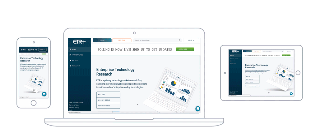
Brand update, market research, responsive design, prototyping, user testing, dev handover
Brand update, competitive analysis, responsive design, prototyping, user testing, deployment
Company Timeline
Company Timeline
Company Timeline
Problem
The company had a private web platform through which all their research content and reports were available to their subscribed clients. With the production of more robust research, ETR was looking to make the platform accessible to the general public. The task to be accomplished was thus based on this requirement - Design a user-friendly public-facing platform.
Audience: Enterprise Leading Technologists like CIOs and IT Executives, Investors, Business Analysts, and Technology Vendors looking to capture real-time market activity.
Need: Enhance the experience of the existing client base and ensure smooth scaling as the number of clients increases.
Opportunity: Create a compelling experience for potential customers who had not interacted with the previous platform at all.
Validating the Problem
The biggest challenge that we had in this project was recognizing the target users and incorporating their expectations in our design solutions. ETR’s existing clients were already familiar with the current interface. For them, something new which would potentially serve the same purpose was not such an ideal solution.
On the other hand, were the new users. CIOs, investors, vendors, of leading corporations, who were not completely familiar with all the research jargon. It was tough to get access to this client base and so a lot of our design decisions were based on the feedback provided by stakeholders who had interacted with them and sold the product to them before.

Our Strategy
We were working on a strict timeline in an agile environment under which the solutions were to evolve through a collaborative effort of cross-functional teams. Adaptive planning and early delivery were imperative to ensure continuous improvement and evolutionary development. Our strategy looked something like this -
Design Process
The very first step was to understand the complexity of the product by breaking down the website into its key navigation components. One of the primary issues with the existing website was that it was not intuitive. The fundamental rule to keep in mind when designing a public-facing website is to eliminate the assumptions that “users would know”.
Based on our initial interactions with the different teams, we got an idea of the key components of the platform and what each of those would roughly consist of.
Once the layout had been mapped down, the next step was to start designing the low-fidelity wireframes. The intention was to depict concepts, design alternatives, and screen layouts. We recognized few issues and a lot of missing pieces in the flow and design structure and created mockups to account for all of those. This process went through multiple iterations, involved cross-functional collaboration, and helped the design process by providing continual validation.
It was imperative to open a conversation in which the users’ needs and the stakeholders’ goals were discussed and aligned before we started polishing up the designs. From these conversations, we also learned that the stakeholders had certain branding preferences and this helped shape our design system.
Below you will see an overview of our branding guidelines, a master file of visual components, and symbols that we utilized in the designs. This again was altered and updated a few times once we started getting into the nitty-gritty of the designs but it helped up maintain consistency in all the components.
As we dove into high-fidelity wireframing, we fell into the process of prototyping one feature design at a time and then presenting it to the stakeholders. We realized during this process that we were missing a lot of edge cases. Even though we tried to map out the elemental flow with low-fidelity designs, it was more of an overview for the entire website. We did not take out the time to flush out user flows before designing a feature and this ended up taking more time in getting the hi-fidelity wireframes approved.
So we decided to go back a step and create more thorough user flows for every feature before jumping into the prototype design.
Feature Design
User journeys helped us recognize the complexity of some of the features and helped accelerate the design process. What followed was an iterative process of prototyping --> presenting --> feedback --> updating. Below you will find some of the user journeys and final results of some of the primary features that make up the product.
Quantitative Research
The company conducted a quarterly survey (TSIS), one bi-annual survey (ETS), and a custom flash survey based on the client requirement (Drill-Down).
One of the main reasons for re-designing this platform was to make it easier for our clients to understand all this quantitative data that the company produced. After all, data is useless if it can’t be comprehended and consumed in a useful way. This data visualization was accomplished with the help of Power BI. Another aspect was the way the company was segmenting the data. Data generated from each of these surveys was segmented further into sections which they internally liked to call 'stories' - which were further divided into 'chapters'. Getting all this information organized into the platform was a little tricky.
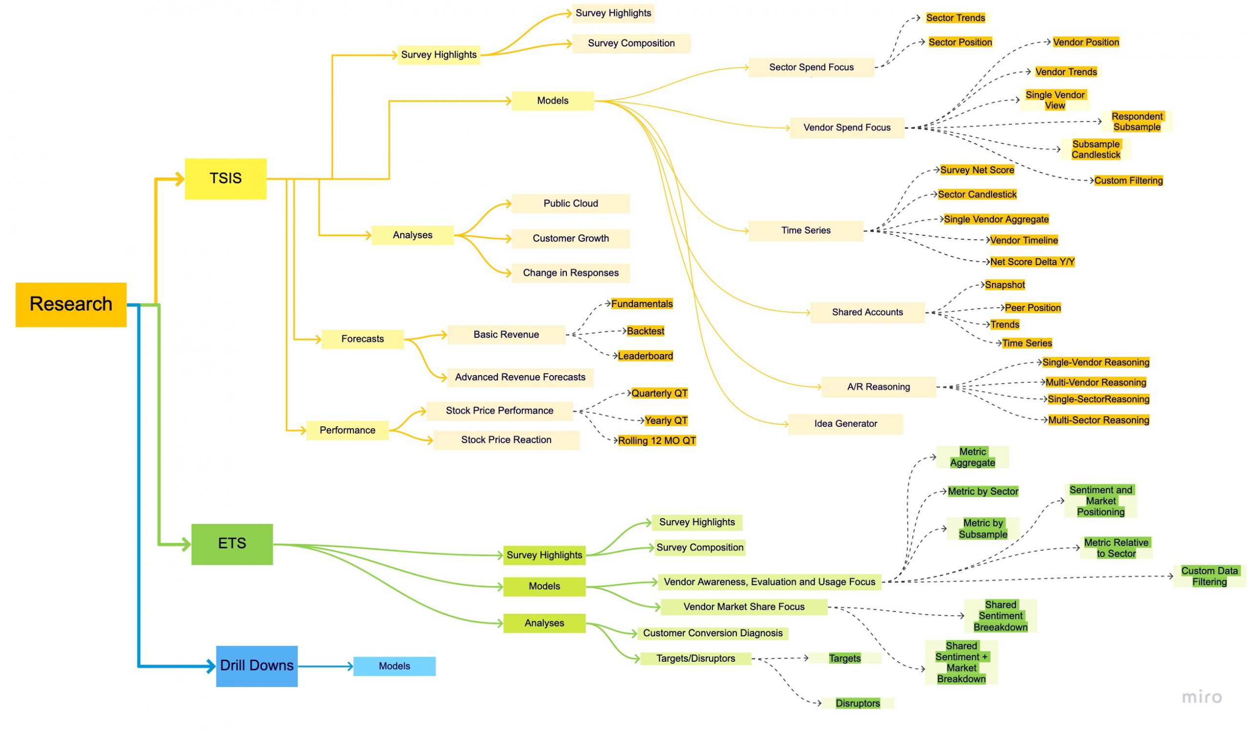
Visual representation of the research produced by the company
Marketplace
The other business requirement that this product was trying to solve was to make it easily accessible to new clients. The company did not just provide raw data but also generated reports to interpret this data. The existing website was closed to subscribers till this point, which limited their client base. They wanted to give users a way to buy individual products so that they could gauge the product without having to invest in a quarterly subscription period. We decided to provide this functionality through a 'Marketplace' wherein users could view and buy our products through a guest checkout process.
There was a search and filter functionality in the Marketplace to make it easier for users to find what they were looking for. Additionally, there were product pages with all the relevant information for every kind of product that the company produced.
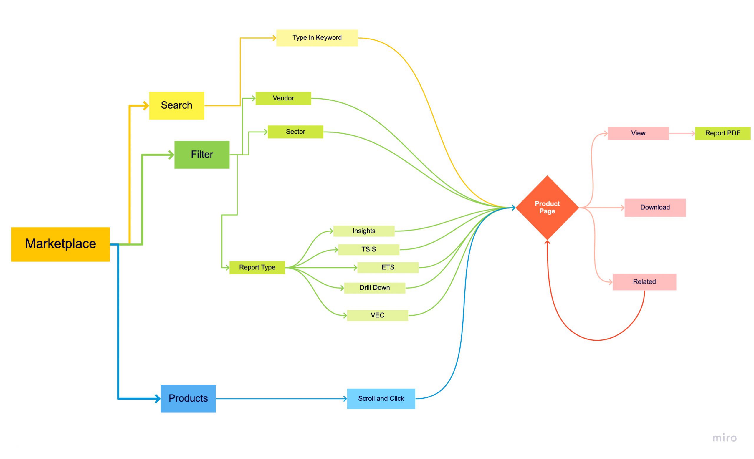
Marketplace of all the reports we produce that can be purchased as an individual product
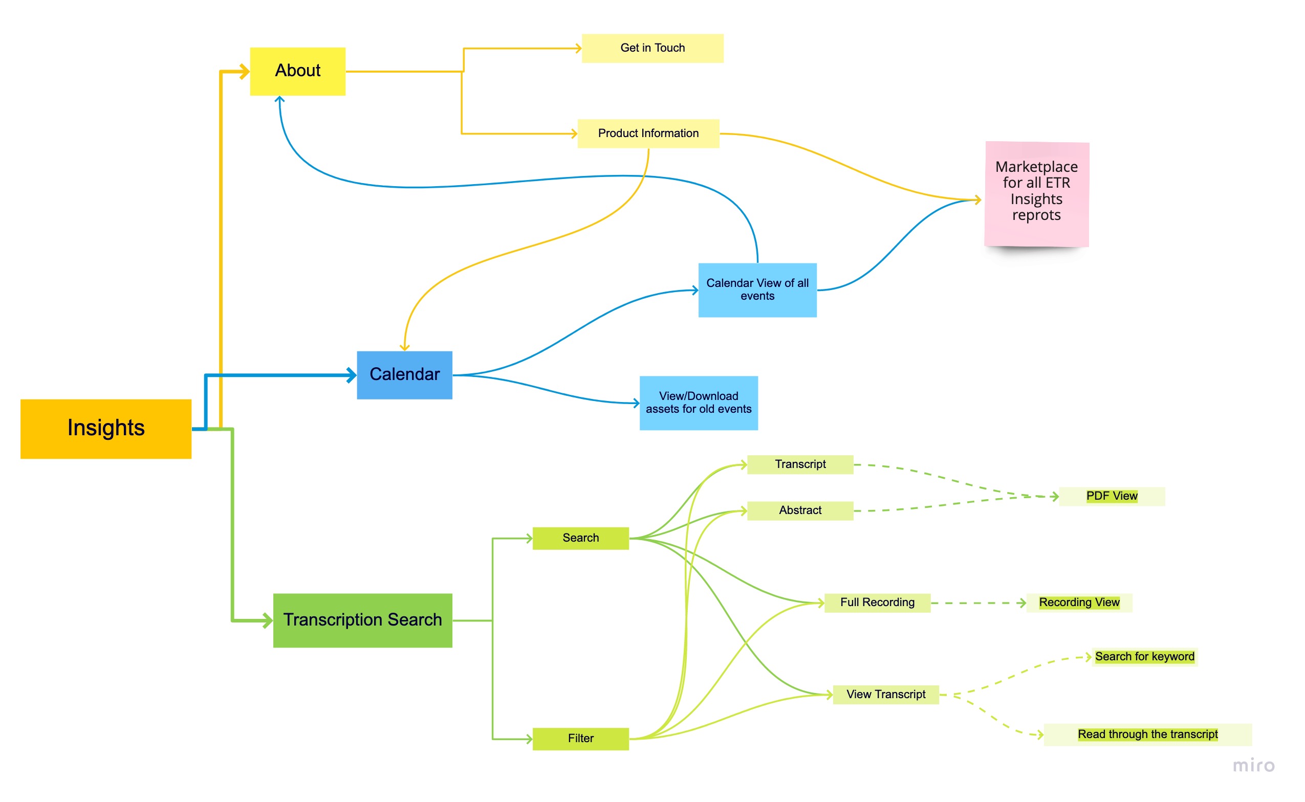
Qualitative Research
In addition to generating quantitative research, the company also produced qualitative research. ETR Insights (originally names VENN and recently re-branded) followed a process of event-based research that leveraged the knowledge of CIOs/IT Decision Makers, Technology Vendor Executives, and Investors.
This product was a part of ETR but also sold as its own subscription. So we decided to give ETR Insights its own landing page. This had information about the service, a quick calendar look at scheduled future events, and one of the most prominent additions here was the 'transcription search'. Similar to the reports we produced for our qualitative data, the transcripts contained complete qualitative data of all interviews we conducted. The transcription search functionality helped you mine ETR Insights transcript database with full language search functionality of expert interviews and events.
Qualitative Research product information and transcription search funtionality
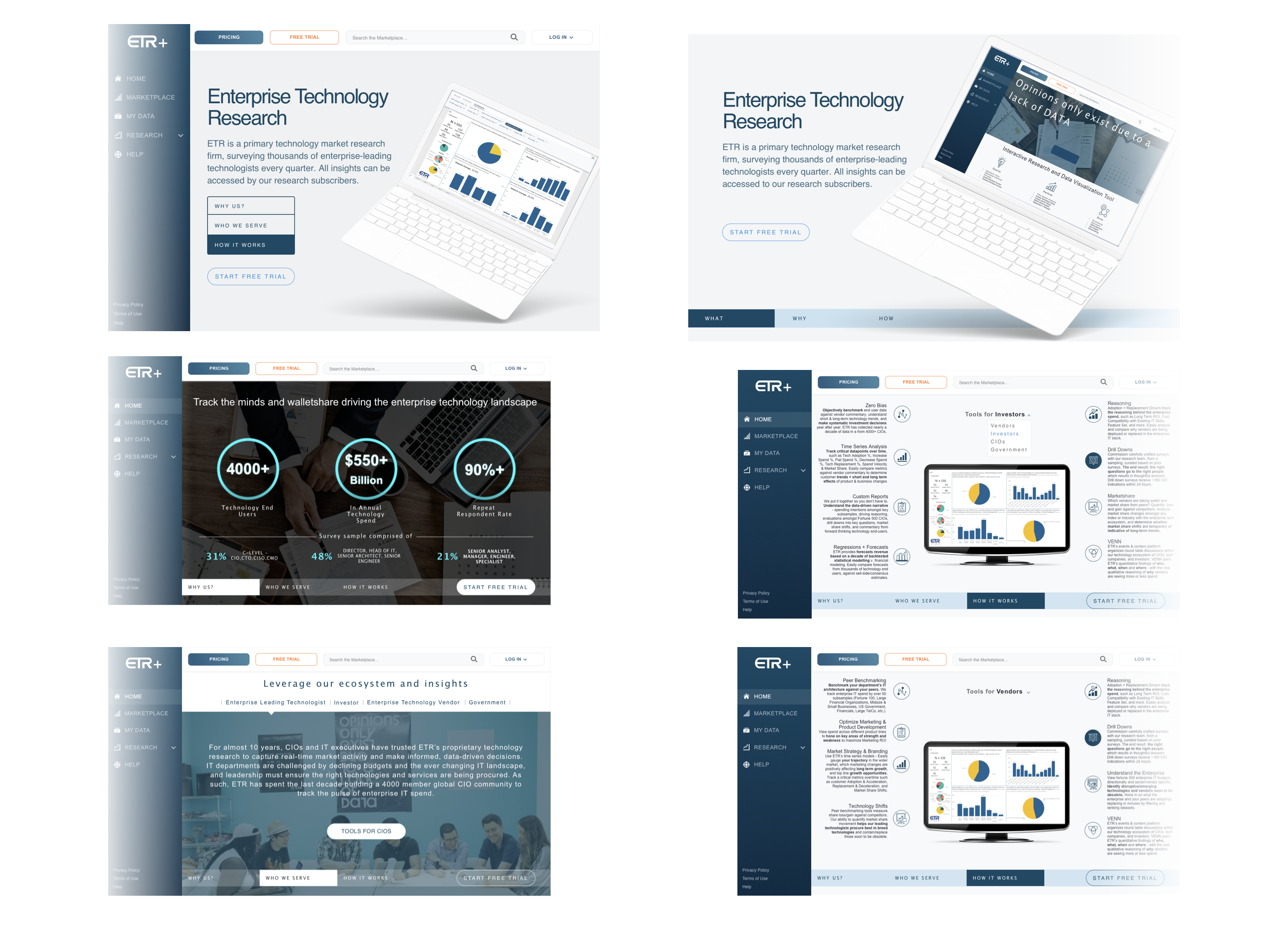
Landing Page
The final step of the design process was the landing page design. This was the first page a new client would see to get an idea about our product and offerings. Having all relevant content on the landing page was essential, but I wanted my design to give the users an option to see only what they were interested in. I was provided with some use cases through which I could recognize all kinds of users that could potentially come to the website and I wanted to create an experience that would consider them all.
I broke down the landing page into three different sections -
WHY? - Why should you choose us? What sets us apart?
WHO? - Who do we serve? Who are our clients?
HOW? - How do we serve? What do you get?
Additionally, ETR already had a client base before this new website was released. In order to keep the learning curve as minimal as possible, we decided to create a customer journey map that users could refer to. This consisted of descriptions of all the key terms required to understand our data and a comparative display of old vs new designs for the features. Check out the user guide here.
Tools Used & Dev Handover
At this stage, I had a prototype ready for every single feature of the website. As a final user test, I sent out prototype links to the stakeholder and all relevant teams (based on the features that would affect them). Simultaneously, I had to get started on the responsive view design for the website. The tools I used throughout my design process are listed here -
- Sketch - Low-fidelity and hi-fi wireframing
- Invision - Prototyping tool
- Craft - For transferring Sketch artboards to InVision
- Design System Manager - To ensure automatic design updates across all platforms
- FontBuddy - To get the missing fonts on individual systems
- Zeplin - To share the wireframe specifications with the development team
- Trunk - Git for Sketch to help in design collaboration
- Trello - Project Management tool for creating user stories
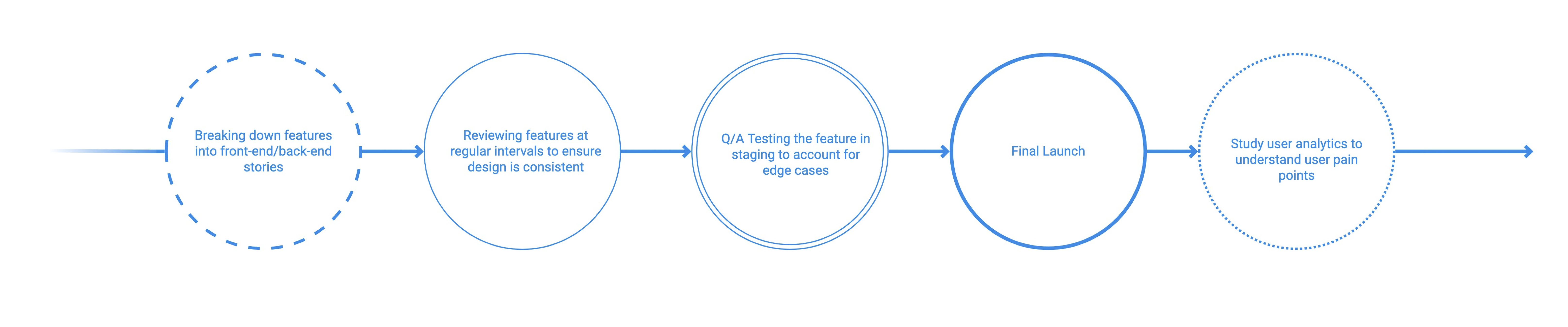
As I got approval, I started breaking down features and making user journey stories for developers to get started on. In order to ensure a smooth dev handover process, I had to work closely with the engineers and address technical constraints by making changes to the designs. The process looked a little like this:
Reflection
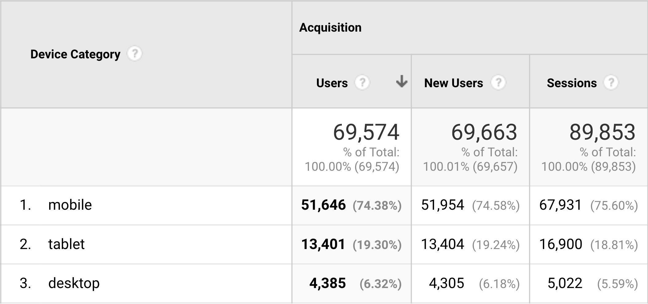
Design Thought Process: The website was essentially designed for desktops view since the company consensus was that most users preferred big monitors and also accounting for the Power BI limitations when it comes to responsive design for data visualization. However, in the very first week, we noticed that 70-80% of the users were using it on mobile. The website was responsive but a lot of responsive design solutions could've been handled better if we had insight into customers' device preferences.
User Testing: We could not conduct proper user testing with our actual client base and this lead to a lot of design decisions that were based either on assumption, or what the business thought made most sense. In retrospect, after the launch of the website I had to study all the analytics we were collecting to understand user pain points and usability issues.
Despite the shortcomings, this project was a big success for me. It taught me how to take complete ownership of the design process, interact with stakeholders to align business requirements with user needs, and gave me the confidence to deliver an elegant design solution.
🗝️ Takeaways
- Re-designed an existing platform to improve usability and make it more accessible to new clients.
- Understood the importance of initiating cross-functional collaboration early in the design process to align towards a common goal and maximize productivity.
- Realized that launching a product is just the first step. What follows is what determines the success/failure of your product.
©️ Malvi Shah 2021