
RAMP is a virtual marketplace for expertise on demand while eliminating the middleman. This application aims at serving two different user types -
- Investors can search and discover subject matter experts to get “ramped” up on a particular topic, industry or company.
- Subject matter experts will have a platform where they can properly monetize their expertise and maximize their payout by not having to pay a middle-man to broker the conversation.
My Roles
My Roles
My Roles
My Roles
My Roles
Branding update, competitive analysis, user research, responsive design, prototyping, user testing, dev handover
Brand update, competitive analysis, responsive design, prototyping, user testing, deployment
Company Timeline
Company Timeline
Company Timeline
Problem
For RAMP, the company had a mobile application in place since the initial assumption was that the product would be used as an Uber for Expertise. However, the onboarding process required a lot of data collection leading to multiple user complaints about needing a web-based solution.
Audience: IT Decision Makers, Subject Matter Experts, Buyside Analysts, Investors
Need: A responsive web-based solution for the product with a mobile-first approach.
Opportunity: Reference the mobile app design and analytics to eliminate making the same mistakes and ensure a seamless experience
Validating the Problem
We already had an alpha launch for the RAMP mobile app which meant we had active users who were using the application and giving us constant feedback at every stage. That is how we got the idea to build a website. The best way to account for all the feedback was to categorize different user types through persona creation.
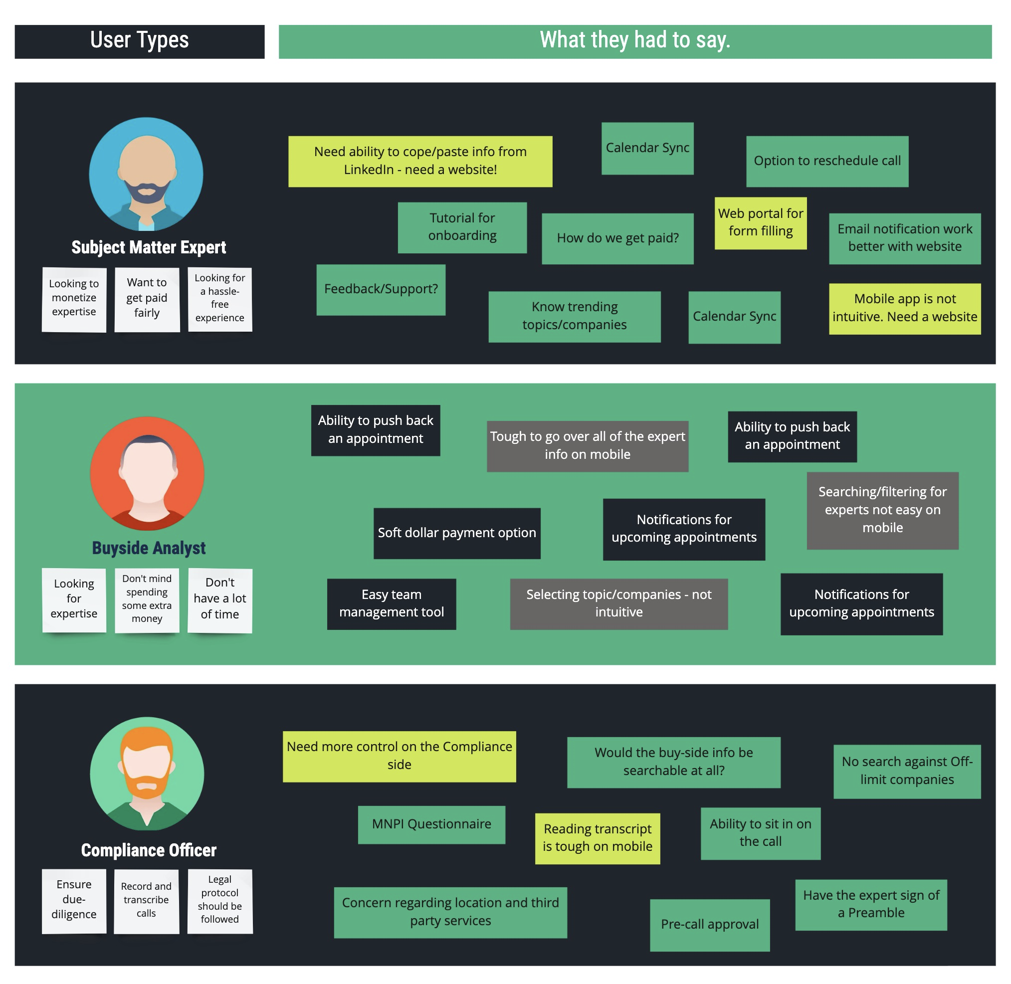
A lot of the issues from each user type indicated the need for a web app. In addition to addressing the demand for new features, a website would also play a big role in improving usability for existing user flows.
Reviewing the Mobile App
When I first started working on RAMP, the mobile app was not completely polished. I familiarized myself with the product and its functioning. Additionally, I was involved in the process of introducing new features to the app to get it ready for deployment and while designing these new features, I also managed to add some new branding to it.
When we took on the project of developing a web app, the mobile app was still live and available on the app store. I decided to study the app by testing it internally with a few stakeholders. We had a lot of new suggestions as well as pain points from our end users but I felt like this face-to-face testing helped me understand basic usability issues with the device restrictions
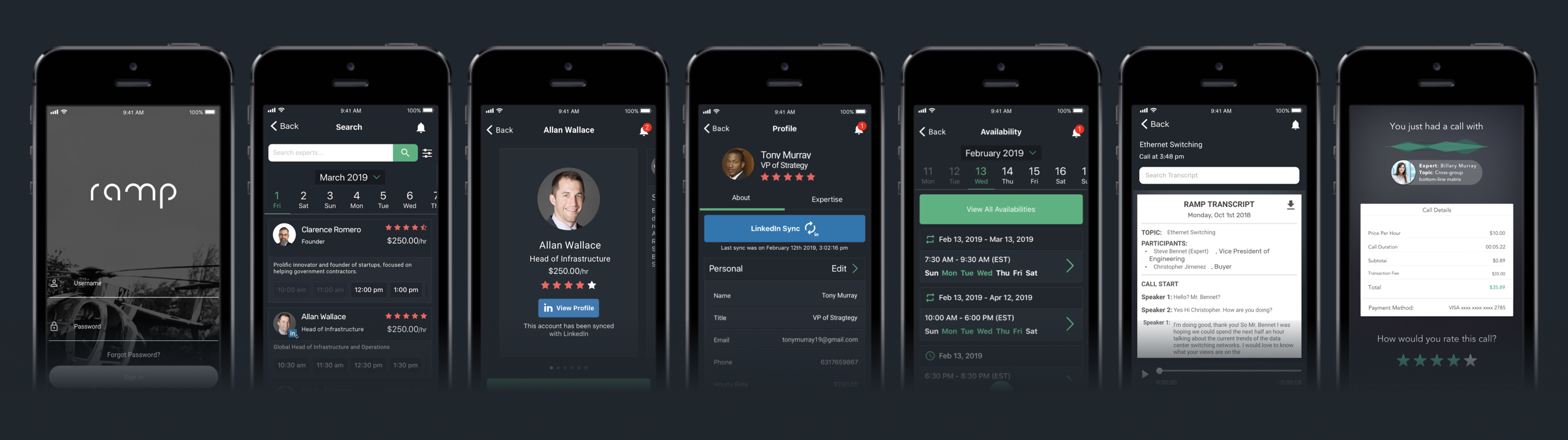
A glimpse of some of the designs from RAMP mobile app
A glimpse of some of the designs from RAMP mobile app
Laying out Design Components
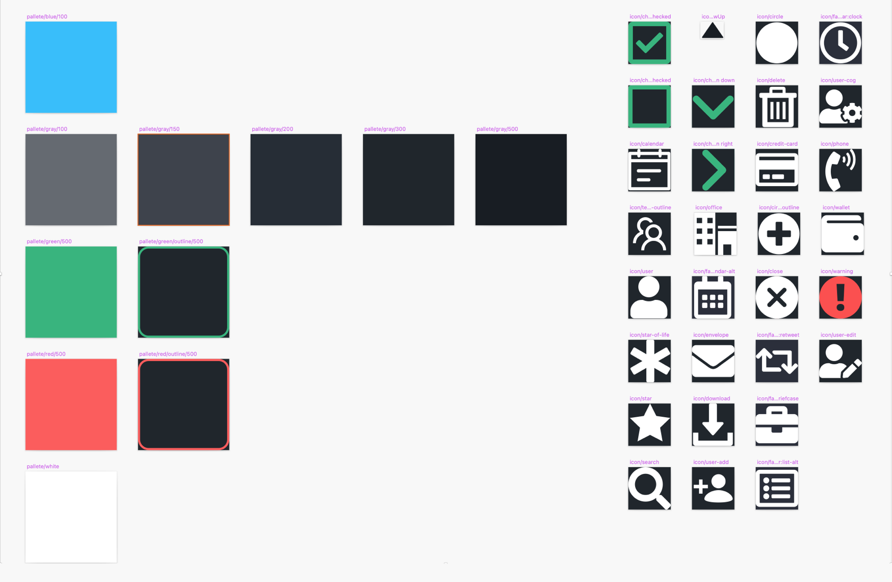
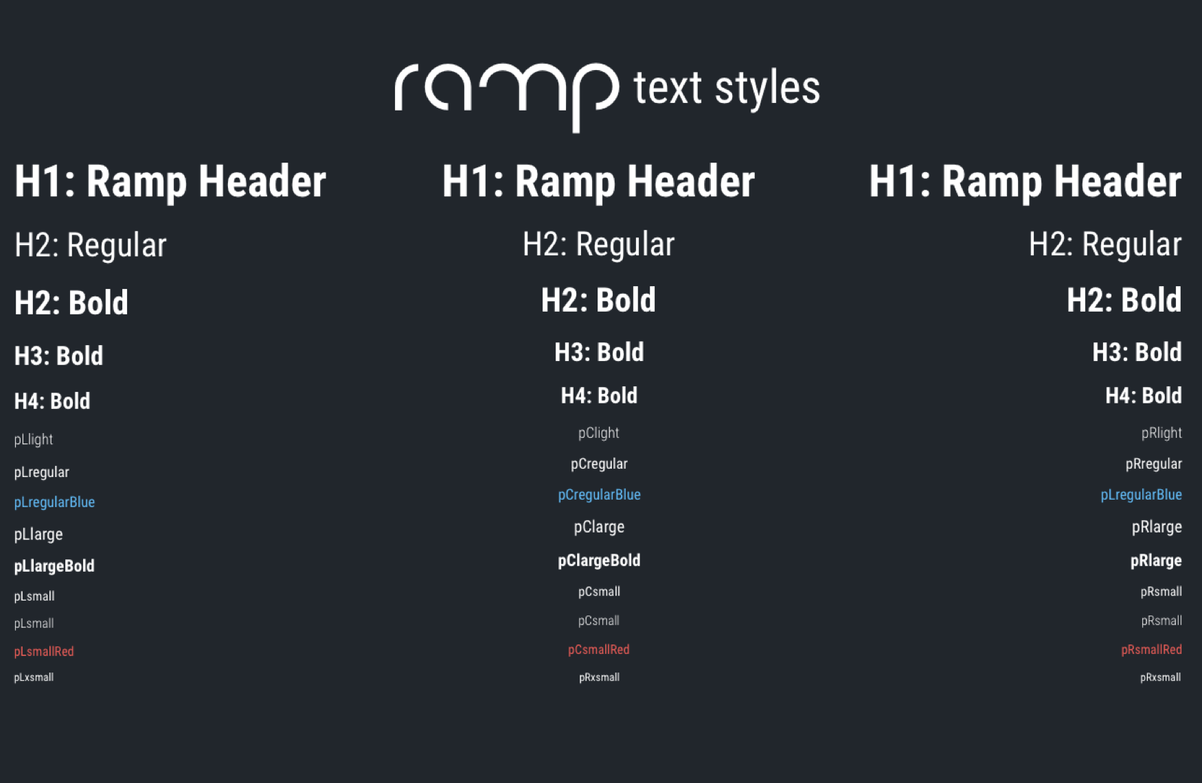
Since the branding and color scheme of the product was already approved, I just had to get it all aligned into a single place. Creating a design library with the component symbols at the beginning helped me maintain consistency throughout the design process. This library constantly gets updated based on changes in user flows, business decisions, and even forgotten edge cases, but the practice of creating reusable components makes it easier to update designs in the long run.
Laying out Design Components
Since the branding and color scheme of the product was already approved, I just had to get it all aligned into a single place. Creating a design library with the component symbols at the beginning helped me maintain consistency throughout the design process. This library constantly gets updated based on changes in user flows, business decisions, and even forgotten edge cases, but the practice of creating reusable components makes it easier to update designs in the long run.
As I started laying out the basics, I realized that I needed to have an idea of the general user flow for the website. The navigation of an application differs largely when comparing a web app to a mobile app. This flow plays a definitive role in determining the components that would make up the product.
As I started laying out the basics, I realized that I needed to have an idea of the general user flow for the website. The navigation of an application differs largely when comparing a web app to a mobile app. This flow plays a definitive role in determining the components that would make up the product.
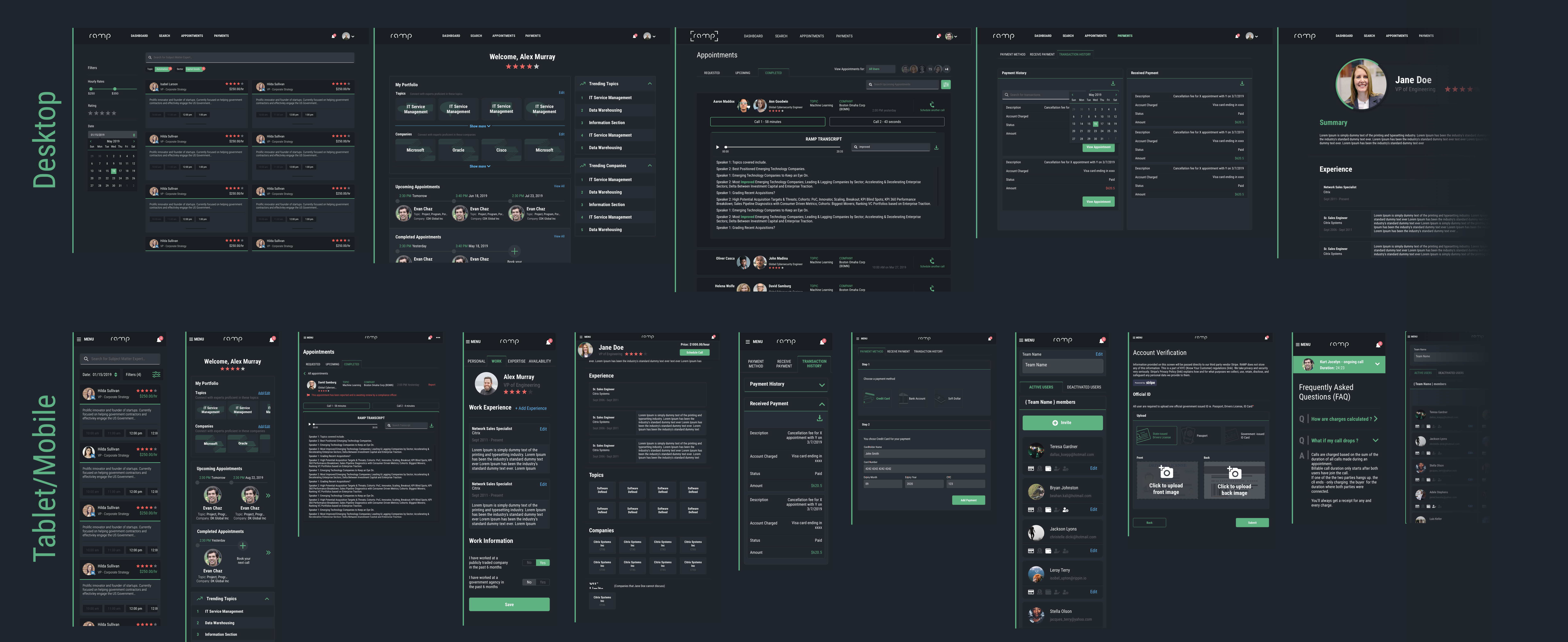
Hi-Fidelity Wireframing
With the help of the components library, I started creating high-fidelity wireframes. The usual web-design process starts with designing for desktop view and then scaling the components down for mobile view. But with RAMP, that was not an option. In spite of a strong case for the need for a website, the plan was to discontinue the mobile app once the web platform was released. This meant that all of the existing users would have to migrate to the web app, and this migration needed to be seamless.
Essentially RAMP was serving the purpose of connecting two distinct users via a call. This undoubtedly made mobile features and functionality crucial to the product design. Keeping this in mind, we decided to start wireframing for different breakpoints from an early stage and considered component placement accordingly.
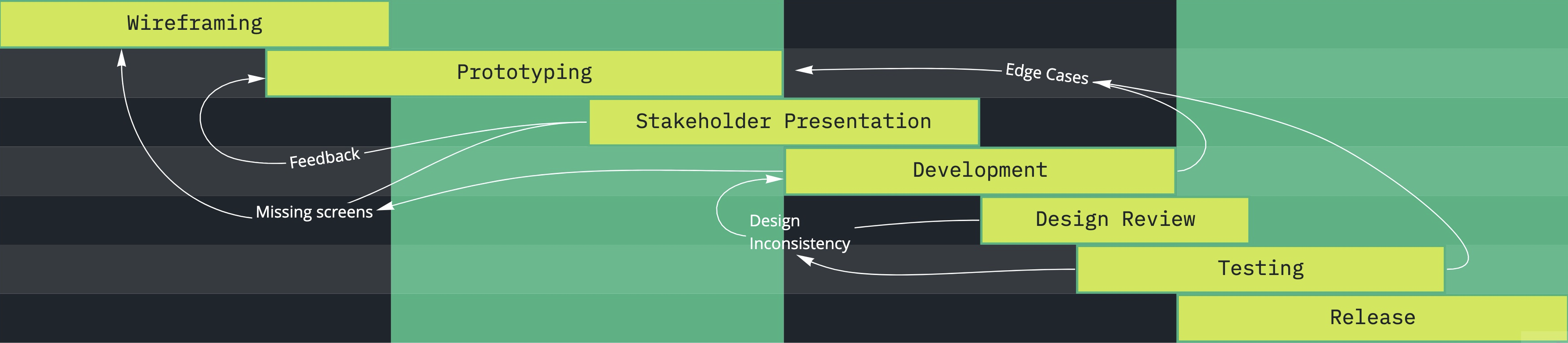
Prototyping Features
Adhering to the principles of an agile workflow, I decided to tackle one feature at a time complete with all the edge cases. This required flushing out the user flows in detail and creating prototypes for stakeholders and engineers to get a thorough understanding. This again was an iterative process and required quite a lot of back and forth but it was still more efficient than perfecting one aspect of the design process before moving on to the next.
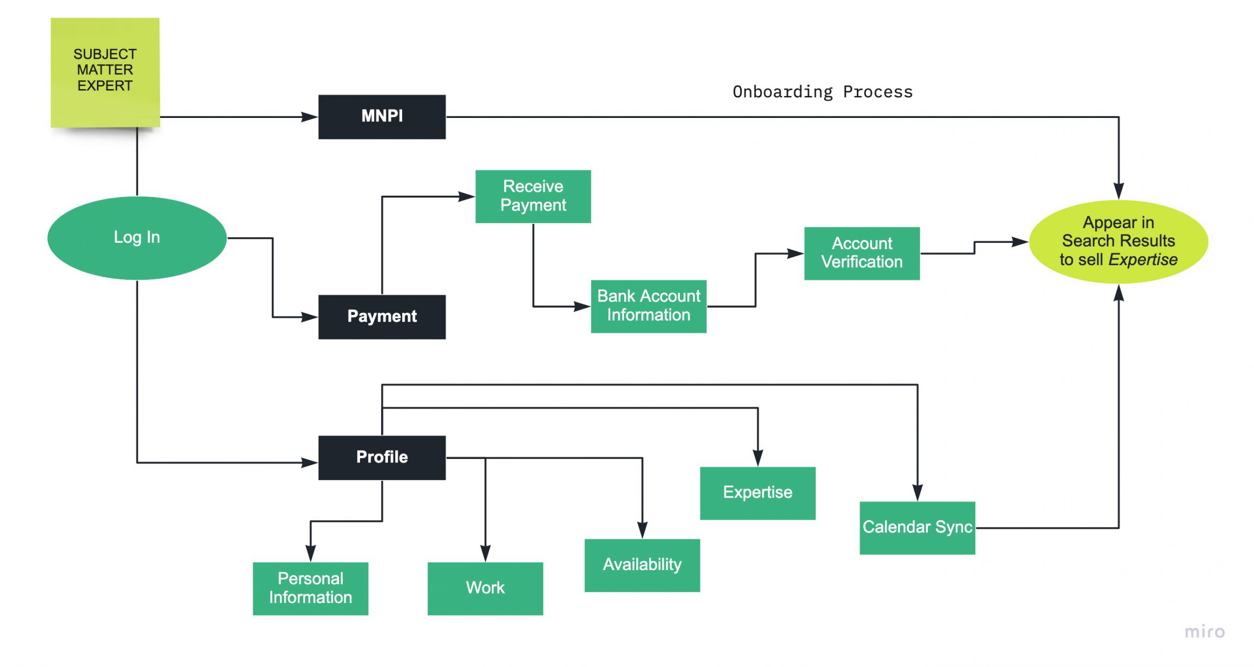
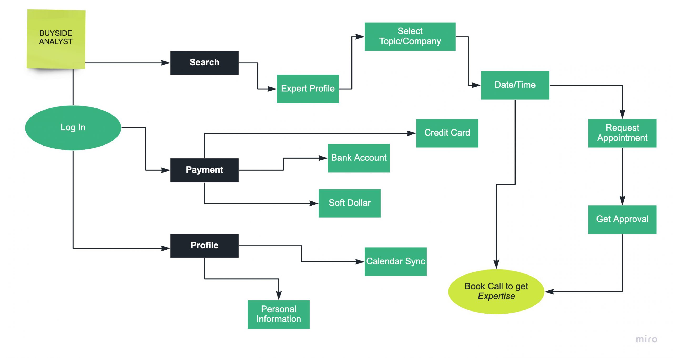
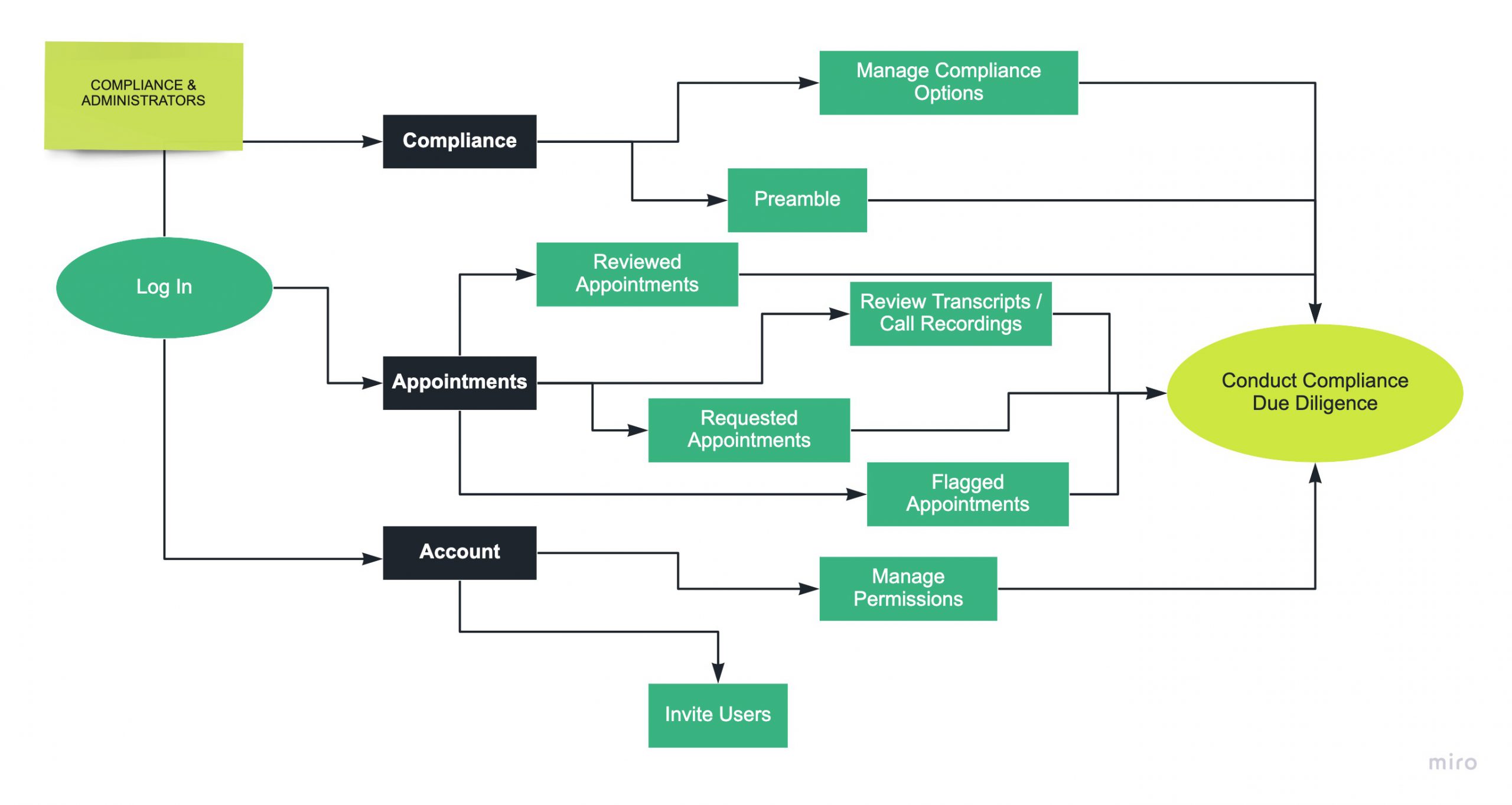
There were three main user types in RAMP
- Subject Matter Expert
- Buyside Analyst
- Compliance Officer / Administrator
There was a connecting element to each of these, but at the core, every user had their own unique journey. Understanding this was essential to the design process.
There were three main user types in RAMP
- Subject Matter Expert
- Buyside Analyst
- Compliance Officer / Administrator
There was a connecting element to each of these, but at the core, every user had their own unique journey. Understanding this was essential to the design process.
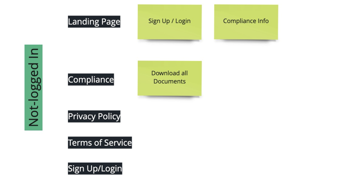
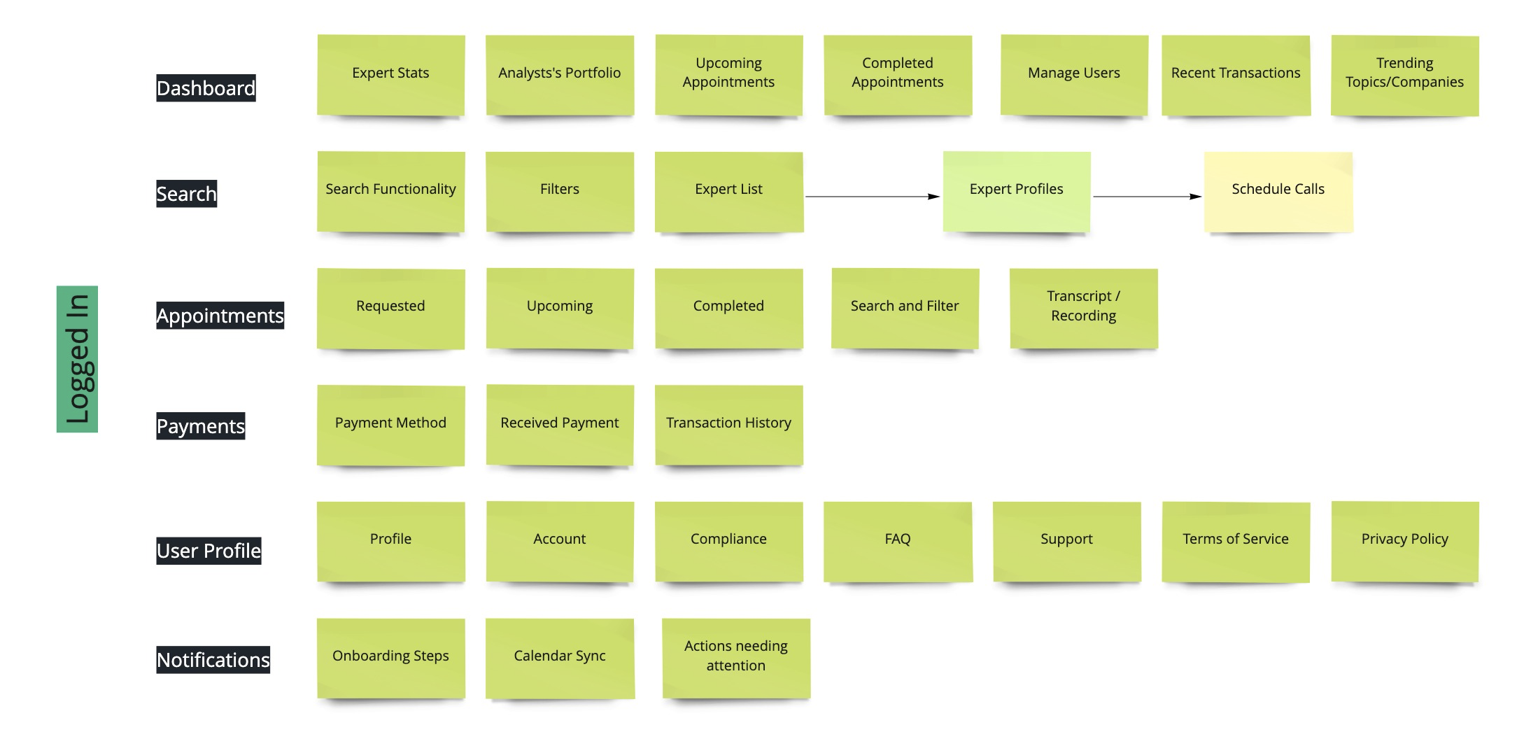
Custom Dashboard
The very first page that the users saw was the dashboard. It was customized to give each user a personalized experience when they first log in. It was essential to show the right data and provide the right tools to all users to ensure they have a coherent experience.
For Subject Matter Experts, the dashboard was designed to show statistical data which they could potentially find useful to view every time they logged into the platform. This included data points like
- Call Frequency
- Total Revenue / month
- Search Appearances
- Profile Views
For Subject Matter Experts, the dashboard was designed to show statistical data which they could potentially find useful to view every time they logged into the platform. This included data points like
- Call Frequency
- Total Revenue / month
- Search Appearances
- Profile Views
For Buyside Analysts, the dashboard had a Portfolio element that let them select all the Topics/Companies that they might be interested in in a single place. They could simply log into the platform, select their topic of interest in the portfolio, and this would lead them to the Search Page with the selected filter applied.
The principal objective here was to reduce the number of clicks to lead end users to aspects of the product that would keep them most engaged.
In addition to all these elements, the dashboard also had certain common components that were useful for both the user types.
- Upcoming/Completed Appointments - To keep track of their schedule
- Trending Topics/Companies
- Recent Transactions
Search / Book Call
RAMP has an admirable database of vetted subject matter experts that the buyside analysts could go through in our Search funtionality. Users have the ability to check out multiple expert profiles before they decide to schedule a call with one.
Analysts can filter through the search page to select the expert they are interested in talking to, go over the expert's profile, and choose to book/request a call. RAMP gives the option to enable the Compliance pre-approval funtionality, at an account level, before scheduling a call. If this compliance option is enabled on a user's account, they would need to request a call instead of booking it.
Once the expert has been selected, the first step is to select the Topic/Company. Next, users can choose a time from the expert's availability, or propose upto three new date/time slots. Last step is to review all the information and Request Appointment.
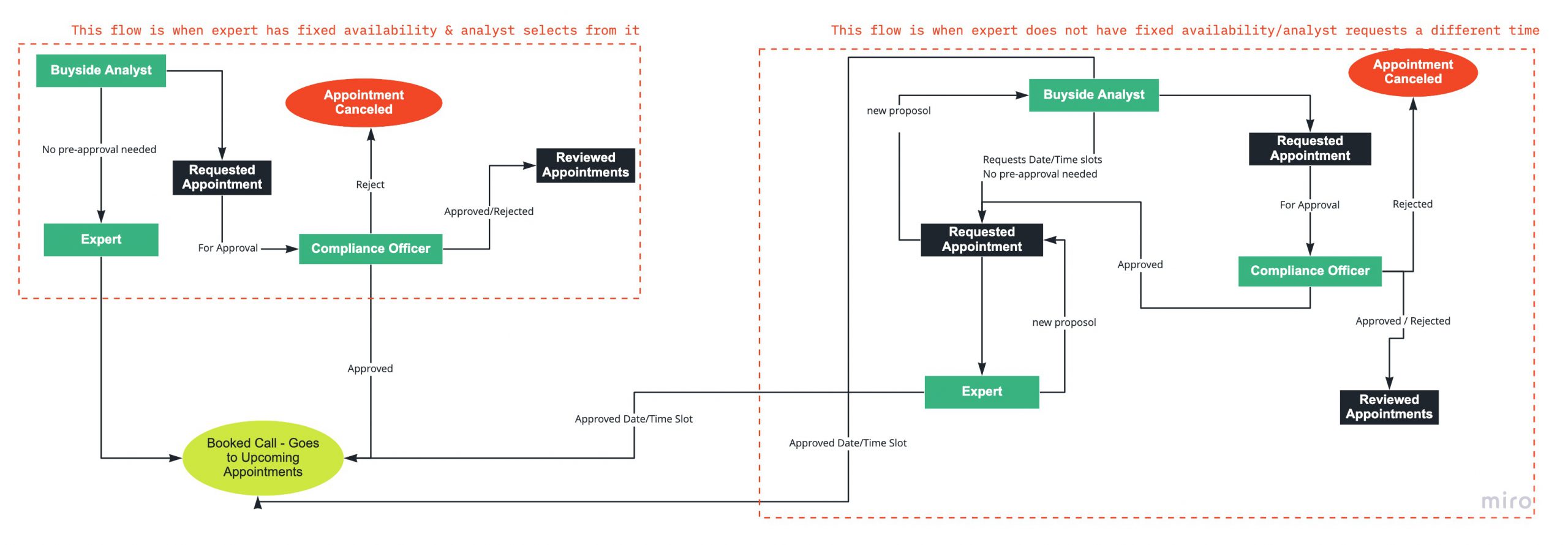
Appointments
Appointments is one of the more complex features of RAMP. The way all different user types are tied in under this funtionality was a little tricky to manage. This feature is divided into four sections and each user is tied to one or more sections based on the user account settings.
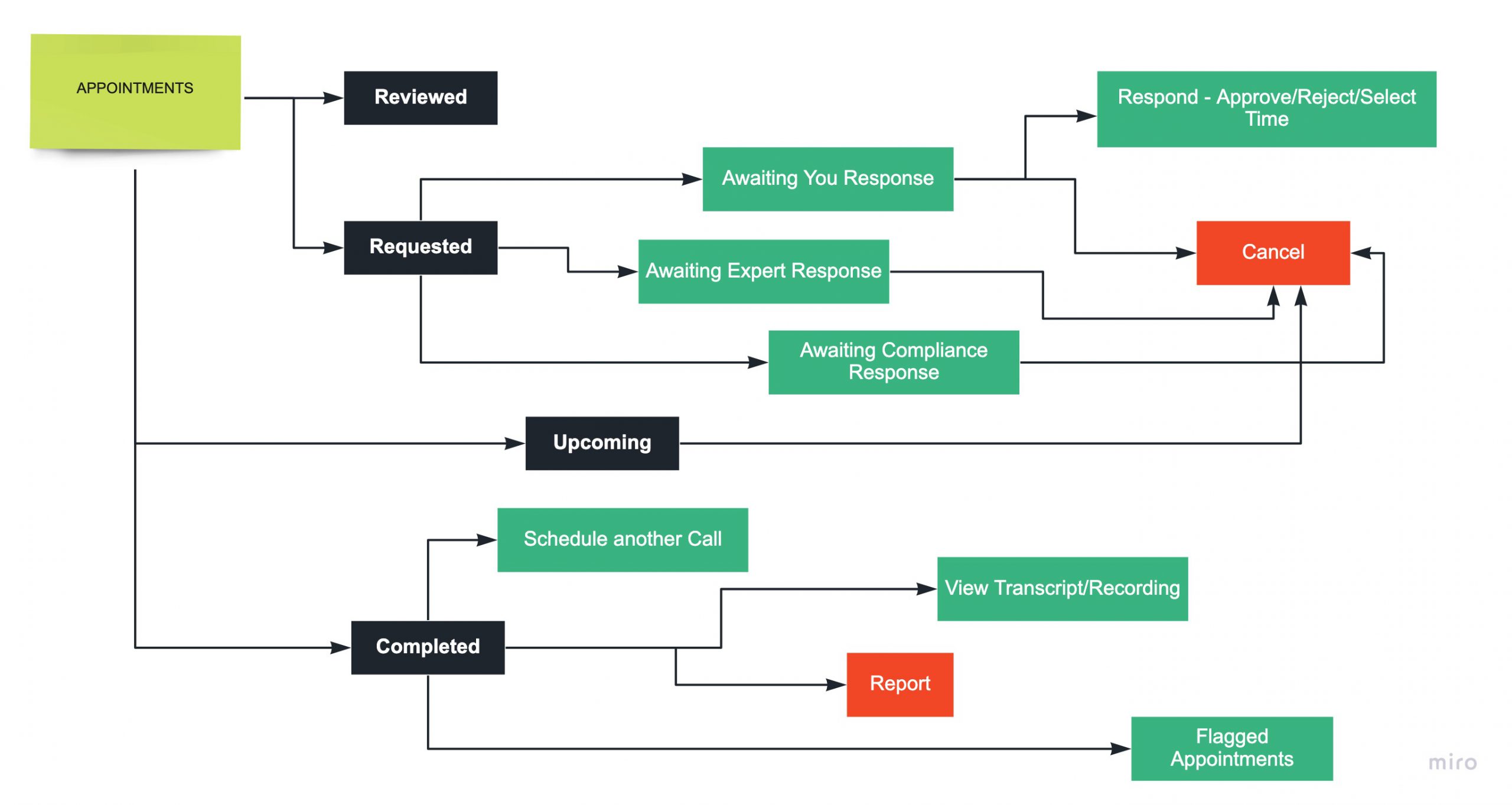
An overview of the sections under 'Appointments' and the options they have
In the image below you will see user flows flushed out for two different scenarios -
- When the expert has a fixed availability & the buyside analyst chooses a slot from it
- When the expert does not have any availabiltiy set up OR when an expert has availability but the buyside analyst decided to request a different one
Payments
RAMP has a pretty straightforward process for payments. One of the notable value propositions of the product is that it eliminates the middleman from the process. This means that the expert is earning more, the analyst is spending less, and we get a % of the transaction thus ensuring 100% transparency on the monetary rate.
Buyside Analysts get the flexibility to pay via "Hard Dollar" or "Soft Dollar". This is done under Payment Method.
Subject Matter Experts would have to key in their Bank Account Information and this would require a Stripe Verification process the first time they set it up. This would live under Receive Payment Once done, they don't have to go deal with Payments at all.
Both user types could see their respective transactions under the Transaction History tab
Landing Page Design
After the features were completely designed and handed over to the engineers, I started wokring on thelanding page design. The complexity of the product and essence of every feature could not just be explained in words. So I decided to create videos to out across the point.
There was one issue. The development process had just begun and it would take a lot more time to create videos from the final product. So I decided to take a different approach.
I created videos with low-fi designs since the purpose they were serving was to make users aware of the all the RAMP features. Once the users logged in, they would see a polished platform. I did not see any value in showing potential clients exactly what they would see if they got access to the platform. I used Framer to create these videos.
The navigation for the front-facing website was also different from what we had desinged. We tried to divide up all the relevant content into distinct pages. One of them was an informative page with all the funtionality that explained our robust compliance framework.
Check out the Landing Page LIVE HERE ➡️
Reflection
Compliance Functionality: Despite taking measurable steps to keep the platform compliant, there were still certain features that we did not design for. Every buy-side account has different compliance requirements and conducting a little more compliance-side research could have helped define certain features better.
Third-party products causing usability issues: We recognized user pain points related to technical constraints in certain third-party products' functionality that we could not improvise on. For example -
- LinkedIn Sync - Subject matter experts wanted the functionality of LinkedIn to expedite the onboarding process of filling out their profile information. We implemented this on our end but a few weeks after release, LinkedIn changed the rules around Third Party Applications Data Use. Since we did not have control over this, we could not come up with a solution to replace it.
- Stripe Verification - When experts keyed in their bank account information, stripe needed to verify the expert's account. For this Stripe asked certain questions that the experts did not feel comfortable answering. This slowed down the expert onboarding process quite a bit.
User Feedback: Having access to an active user base turned out to be a bonus for us when we first started designing RAMP web. Halfway through the process though, it got a little messy. Including all the feedback that came in made our features far more complicated than we had anticipated. At some point, we lost sight of our core product.
It would have made a huge difference if we had filtered out the feedback, ensured it aligned with our business goals, and learned to say no to certain suggestions. Through this design process, I discovered that it is imperative to find the right balance between user feedback and business requirements to ensure the success of a product.
🗝️ Takeaways
- Designed a web-based application based on an existing mobile app owing to popular user demand.
- Successfully implemented an agile workflow for the design-dev process resulting in improved quality through transparency, focus on core business values, and a faster launch.
- Tested assumptions and design hypotheses with stakeholders, experts, and buyers to guide my design.
🗝️ Takeaways
- Re-designed an existing platform to improve usability and make it more accessible to new clients.
- Understood the importance of initiating cross-functional collaboration early in the design process to align towards a common goal and maximize productivity.
- Realized that launching a product is just the first step. What follows is what determines the success/failure of your product.
©️ Malvi Shah 2021