
CarpoolWorld has been the global leader in authentic rideshare matching since its website launch in 2000. Unlike other ride-hailing apps, CarpoolWorld enables substantial cost savings for drivers and passengers while alleviating infrastructure and environmental impacts. The company has registered more than 500,000 individual users and hundreds of prestigious universities, municipalities, hospitals, and corporate ride-sharing groups across the U.S.A. and around the world.
CarpoolWorld has been the global leader in authentic rideshare matching since its website launch in 2000. Unlike other ride-hailing apps, CarpoolWorld enables substantial cost savings for drivers and passengers while alleviating infrastructure and environmental impacts. The company has registered more than 500,000 individual users and hundreds of prestigious universities, municipalities, hospitals, and corporate ride-sharing groups across the U.S.A. and around the world.
My Roles
My Roles
My Roles
My Roles
My Roles
Product analysis, mobile-app design, prototyping, user testing
Brand update, competitive analysis, responsive design, prototyping, user testing, deployment
Team
My Roles
My Roles
My Roles
My Roles
Damini Bhatt, Suleiman Ali Shankar, Malvi Shah
Brand update, competitive analysis, responsive design, prototyping, user testing, deployment
Company Timeline
Company Timeline
Company Timeline
Problem
The company wanted to further expand its reach but realized that most of the clients were looking for a mobile app for ease of accessibility. They had a low-fidelity prototype that they wanted us to work off of.
Audience: The company already had 30+ prestigious paying clients who gave them about 500,000 users, a majority of which comprise of corporate companies.
Need: Enhance the user experience by designing a mobile app to increase the user retention rate and improve the data collection process.
Opportunity: Create a compelling experience for potential customers who had not interacted with the previous platform at all.
Validating the Problem
Each team member was working over the summer and this helped us get an understanding behind the thought process of interns/newly hired employees and the issues they face in their commute to work. One of our own team members had this situation and this helped us gain invaluable insight into the problem. Instead of creating personas for our users, we decided to take a different approach. We created a common story for a general use case of the application.
Our Strategy
We were working on a strict timeline in an agile environment under which the solutions were to evolve through a collaborative effort of cross-functional teams. Adaptive planning and early delivery were imperative to ensure continuous improvement and evolutionary development. Our strategy looked something like this -
Evaluating existing Website
The very first step was to get familiarized with the existing website and recognize the issues. We thought it best to test the app on mobile realizing it could give us a clear picture of the users' thought process, their interactions, expectations, and pain points.
Some of the comments that the users made during this process helped us recognize the notable issues that existed with the interface.

From this initial testing, we discovered there were several issues, big and small, that needed to be addressed. We did not want to get distracted from the final goal by going into multiple design directions, and so we decided to organize all these issues based on their severity levels.
Mobile-App Redesign
The research findings along with the client requirements eventually helped us narrow down our goals. Due to the time constraint, we determined that it is imperative that the visual aspect of our design is informed by our holistic strategy first, and amplified by their aesthetic integrity second. We decided to focus more on the layout structure and placement rather than high-fidelity visual design, and honor the CarpoolWorld branding.
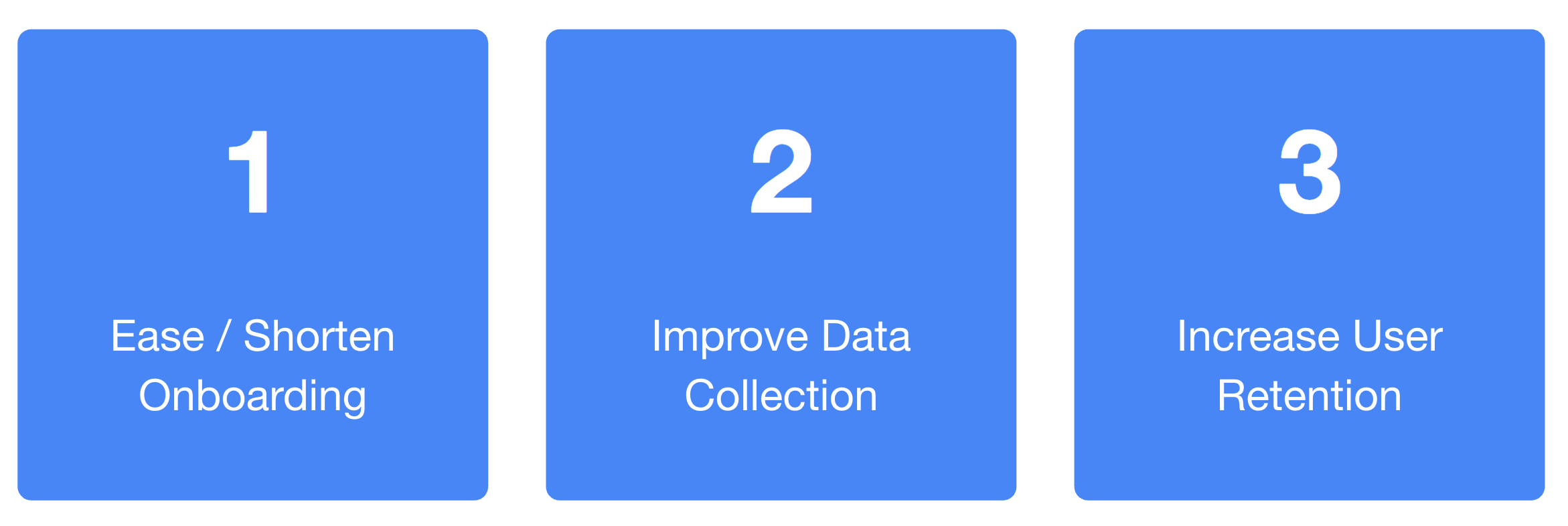
Ease and Shorten Onboarding
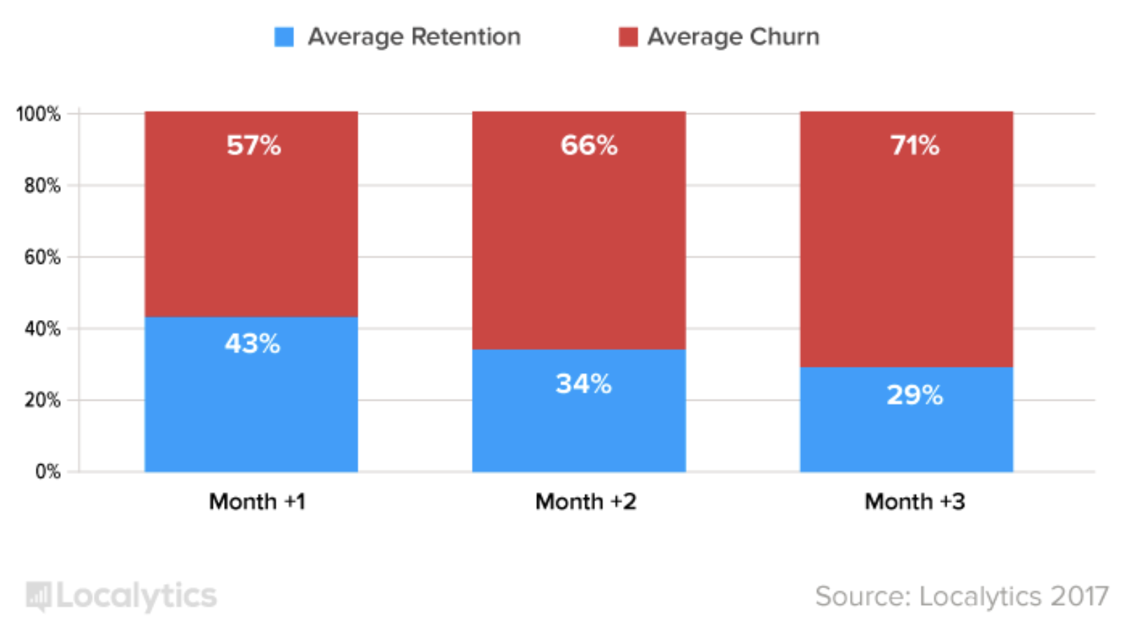
Onboarding is one of the most critical phases of an app user’s journey. Your initial interactions could be awkward and confusing or there could be an instant connection. In both of these settings, first impressions are everything! General research suggests that on average, 71% of all app users churn within 90 days. Onboarding helps clearly communicate “what benefit the app provides to users”. It gives them a heads up on what to expect and what it helps them accomplish.
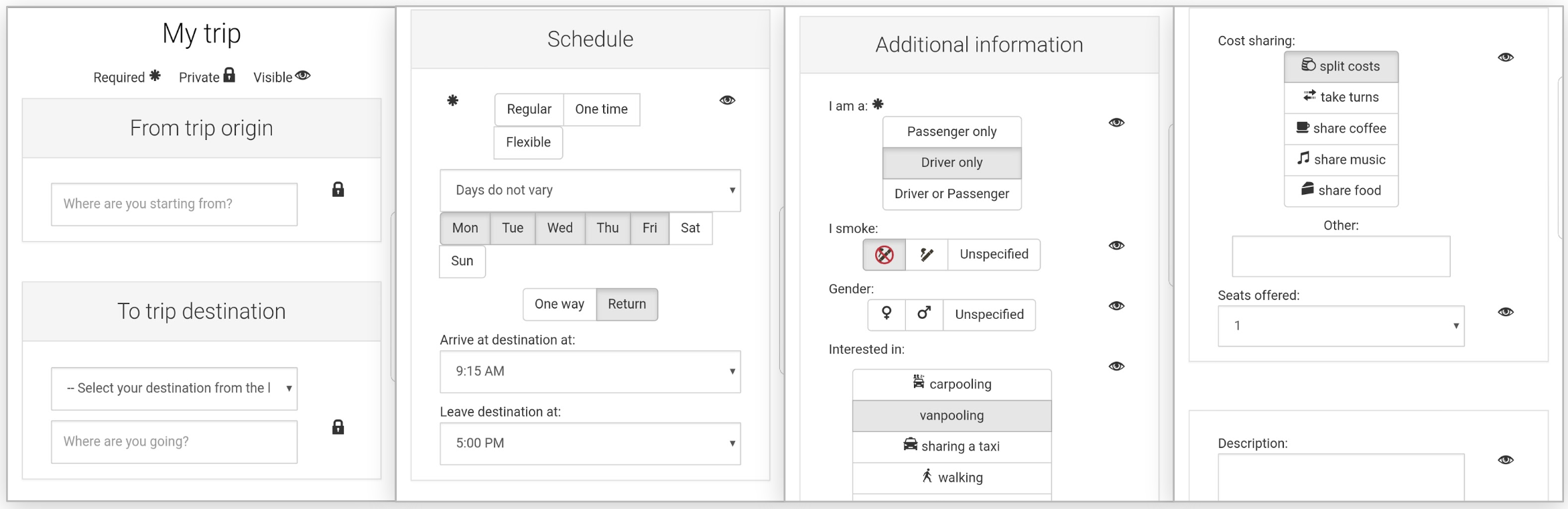
The onboarding flow in the existing application asked users to fill out a lot of information before even showing them what the end goal is.
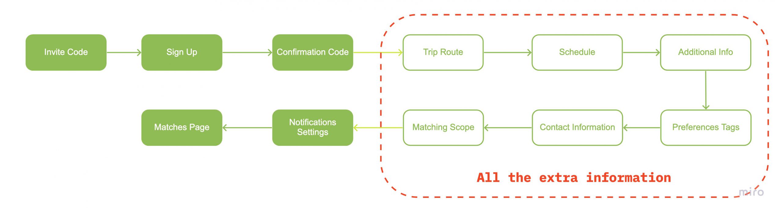
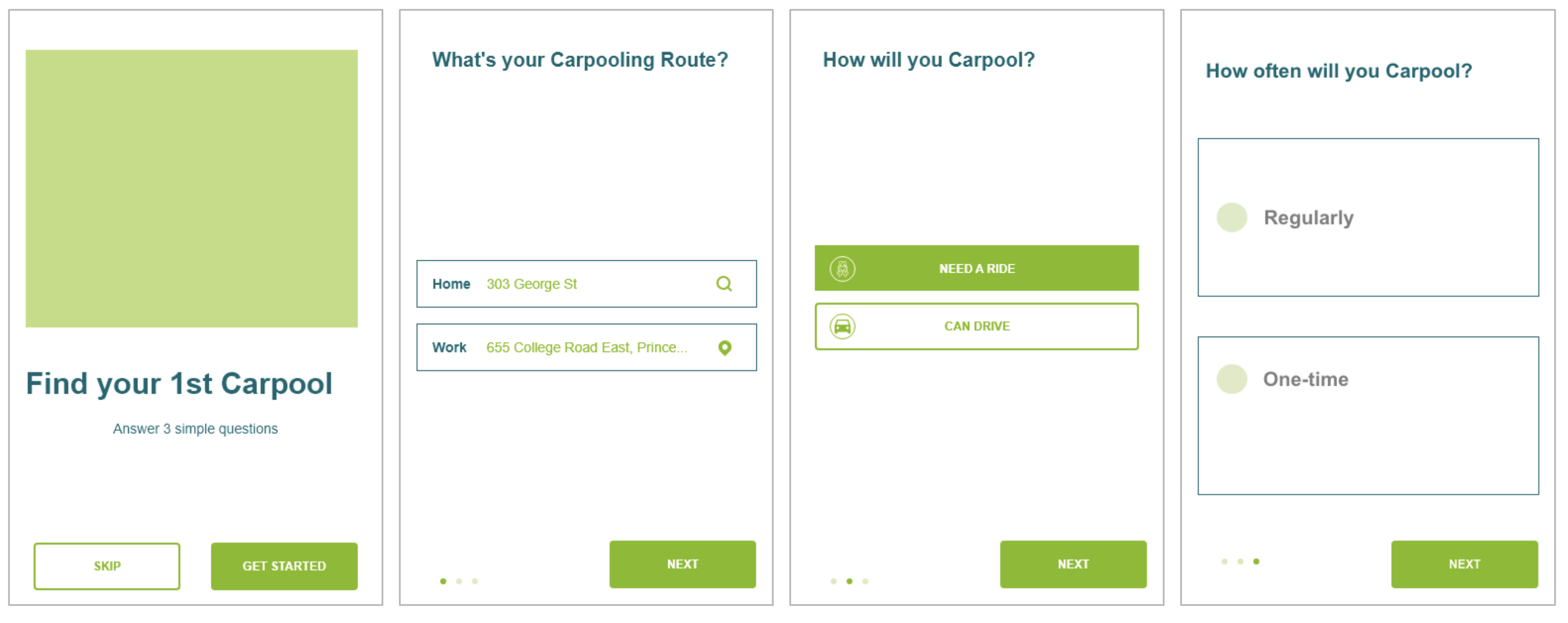
We decided to come up with a short, clear onboarding process that would enhance user interaction by reducing the cognitive load. We decided that informing the users exactly how many questions they’d have to answer upfront, in order to land on the matches page(a home page of sorts with all the listings of potential carpooling matches), would give them the motivation to complete the onboarding flow.
We decided to come up with a short, clear onboarding process that would enhance user interaction by reducing the cognitive load. We decided that informing the users exactly how many questions they’d have to answer upfront, in order to land on the matches page(a home page of sorts with all the listings of potential carpooling matches), would give them the motivation to complete the onboarding flow.
We decided to come up with a short, clear onboarding process that would enhance user interaction by reducing the cognitive load. We decided that informing the users exactly how many questions they’d have to answer upfront, in order to land on the matches page(a home page of sorts with all the listings of potential carpooling matches), would give them the motivation to complete the onboarding flow.
We decided to come up with a short, clear onboarding process that would enhance user interaction by reducing the cognitive load. We decided that informing the users exactly how many questions they’d have to answer upfront, in order to land on the matches page(a home page of sorts with all the listings of potential carpooling matches), would give them the motivation to complete the onboarding flow.
You cannot really predict the state of mind of every single test user. Keeping this in mind, we decided to have the ’SKIP’ option on the first page, to ensure that users who did not want to go through the onboarding could land directly on the matches page to see what options they have. Again, the app cannot give match suggestions specific to the users without actually getting the basic information from the users. This could also be accomplished by navigating the users from the matches page back to the profile page to fill in their information. We accomplished this by providing a small notifications icon at the top right corner of the page.
You cannot really predict the state of mind of every single test user. Keeping this in mind, we decided to have the ’SKIP’ option on the first page, to ensure that users who did not want to go through the onboarding could land directly on the matches page to see what options they have. Again, the app cannot give match suggestions specific to the users without actually getting the basic information from the users. This could also be accomplished by navigating the users from the matches page back to the profile page to fill in their information. We accomplished this by providing a small notifications icon at the top right corner of the page.
You cannot really predict the state of mind of every single test user. Keeping this in mind, we decided to have the ’SKIP’ option on the first page, to ensure that users who did not want to go through the onboarding could land directly on the matches page to see what options they have. Again, the app cannot give match suggestions specific to the users without actually getting the basic information from the users. This could also be accomplished by navigating the users from the matches page back to the profile page to fill in their information. We accomplished this by providing a small notifications icon at the top right corner of the page.
You cannot really predict the state of mind of every single test user. Keeping this in mind, we decided to have the ’SKIP’ option on the first page, to ensure that users who did not want to go through the onboarding could land directly on the matches page to see what options they have. Again, the app cannot give match suggestions specific to the users without actually getting the basic information from the users. This could also be accomplished by navigating the users from the matches page back to the profile page to fill in their information. We accomplished this by providing a small notifications icon at the top right corner of the page.
Improving Data Collection and User Retention
The existing website follows the process of explicit data collection, asking way too much information earlier, in order to obtain intentional data at face value.
Improving Data Collection and User Retention
The existing website follows the process of explicit data collection, asking way too much information earlier, in order to obtain intentional data at face value.
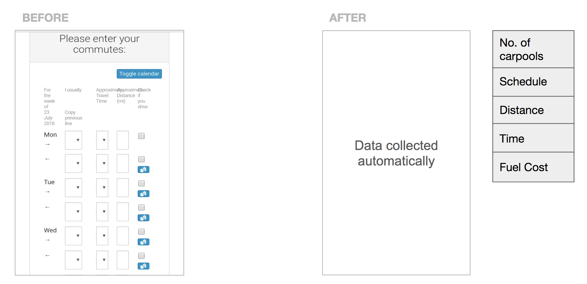
All this data required by the commuting habits survey can be taken in the background instead of asking those questions. This can be achieved using Google Maps API, which gives approximate distance and time based on location information.
All this data required by the commuting habits survey can be taken in the background instead of asking those questions. This can be achieved using Google Maps API, which gives approximate distance and time based on location information.
All this data required by the commuting habits survey can be taken in the background instead of asking those questions. This can be achieved using Google Maps API, which gives approximate distance and time based on location information.
All this data required by the commuting habits survey can be taken in the background instead of asking those questions. This can be achieved using Google Maps API, which gives approximate distance and time based on location information.
Proposed New Features
As effective as Google API was, it could not collect all the information. We had a few recommendations on how to collect the remaining data.
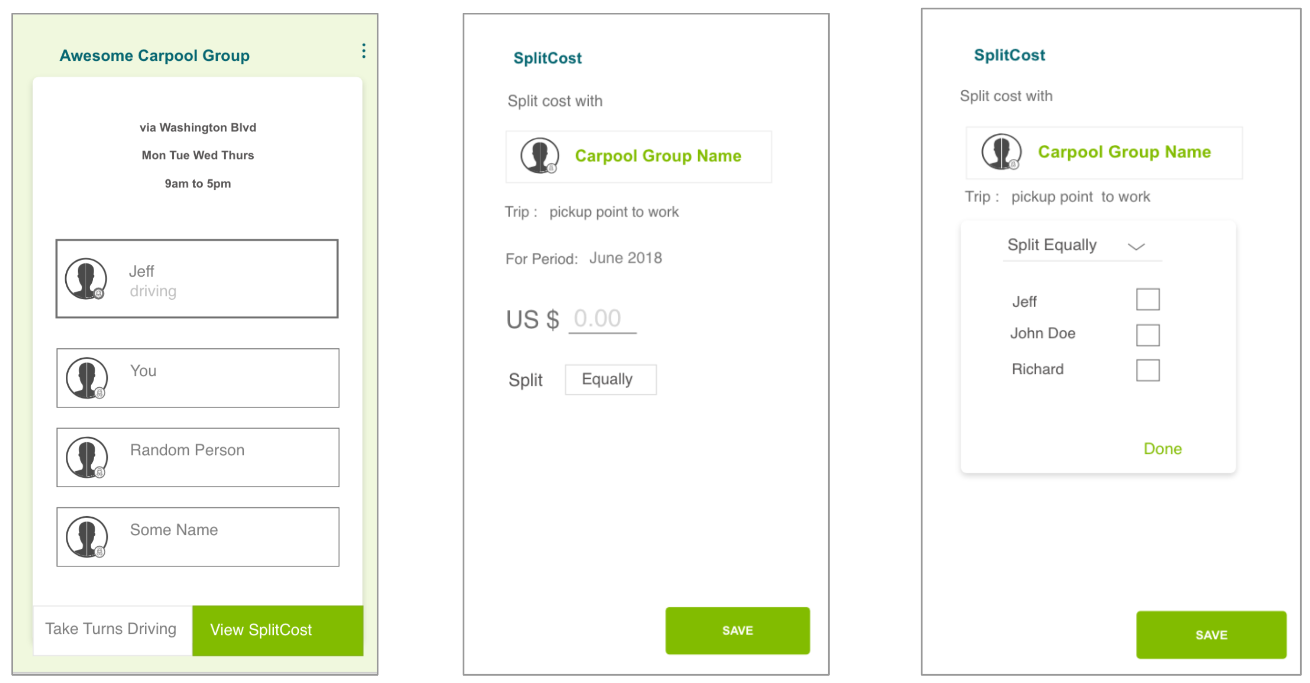
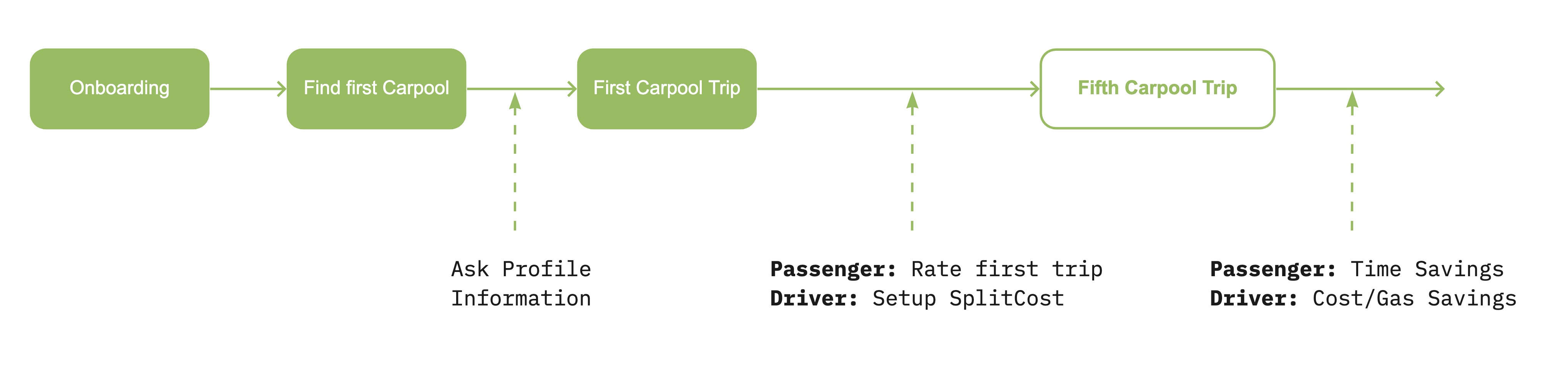
1. SplitCost is a provision track carpooling expenses for trips and fuel. The feature addresses both the goals. The feature addresses both goals -
- Retention rate - SplitCost gives a reason for people to keep coming back to the app.
- Data collection - Users would voluntarily enter trip expenses (data) because the app, through SplitCost, is helping them manage their carpool costs.
We did a quick design mockup of the SplitCost feature.
"What if a user has a car, but does not want to drive every single day? What if you are a part of a big carpool group where everyone takes turns to drive?"
2. Take Turns solves this problem by enabling the users to put the requirements for their specific carpool group on the app. This would ensure that the app keeps track of the group’s schedule and the person responsible for driving gets a notification from the app itself. The Take Turns feature would encourage users to key in their information and thus promote the process of background information collection for the application
Gradual Data Collection
In addition to the auxiliary features we introduced, we also devised a solution for gradual data collection. This method would give the users enough time to familiarize themselves with the app and be satisfied with its service. Once the user needs have been fulfilled, the data collection process can be introduced gradually.
Final User Testing
With the new features designed, we created a prototype to test it at our respective workplaces.
Final User Testing
With the new features designed, we created a prototype to test it at our respective workplaces.
Final User Testing
With the new features designed, we created a prototype to test it at our respective workplaces.
Final User Testing
With the new features designed, we created a prototype to test it at our respective workplaces.
Our end users included friends and acquaintances who did not own a car and needed to travel to work everyday
Our end users included friends and acquaintances who did not own a car and needed to travel to work everyday
Our end users included friends and acquaintances who did not own a car and needed to travel to work everyday
Our end users included friends and acquaintances who did not own a car and needed to travel to work everyday
Our end users included friends and acquaintances who did not own a car and needed to travel to work everyday

| “I find the new app much more usable than the existing web-mobile app.”
| “The current app asks lot of information to create a trip, right after creating an account. The new one is short and better!”
| “I find the new app much more usable than the existing web-mobile app.”
| “The current app asks a lot of information to create a trip, right after creating an account. The new one is short and better!”
| “I find the new app much more usable than the existing web-mobile app.”
| “The current app asks a lot of information to create a trip, right after creating an account. The new one is short and better!”
| “I find the new app much more usable than the existing web-mobile app.”
| “The current app asks a lot of information to create a trip, right after creating an account. The new one is short and better!”
| “I find the new app much more usable than the existing web-mobile app.”
| “The current app asks a lot of information to create a trip, right after creating an account. The new one is short and better!”
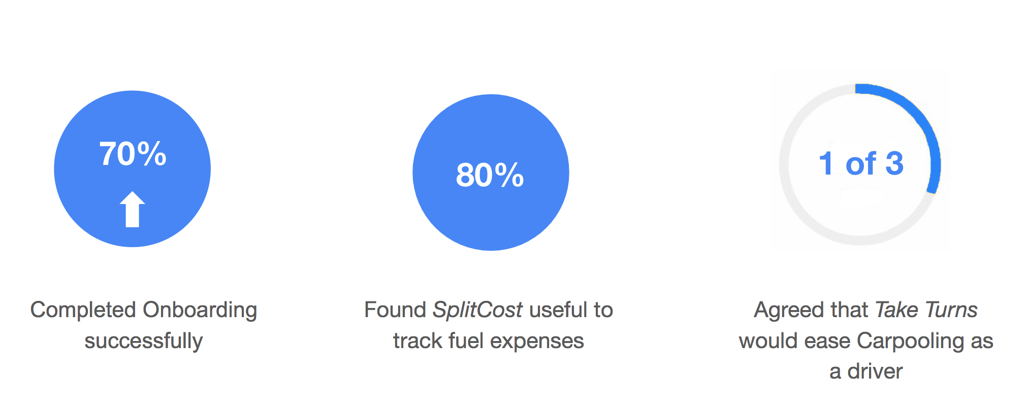
The final round of user testing helped us compile some quantitative data to strengthen our findings.
Reflection
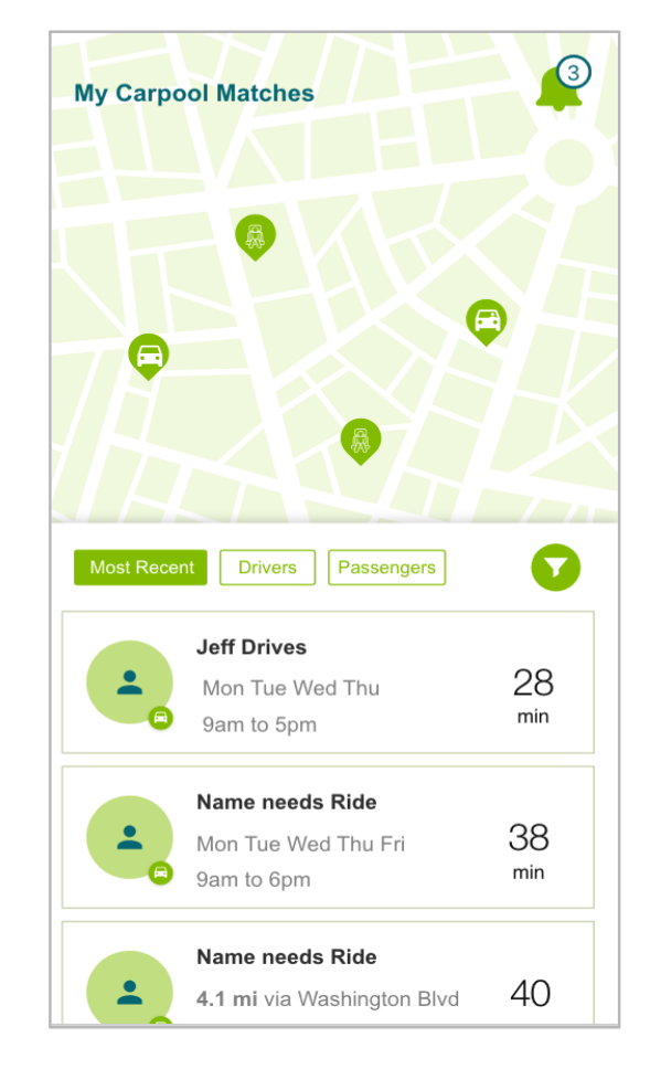
Based on our initial research and user testing, we found an issue with the map they were using to display potential matches for users. User testing concluded that most users found that map confusing and unnecessary. Our clients had been paying $2000/month for the past 10 years to display that map. This research finding saved our clients a lot of money.
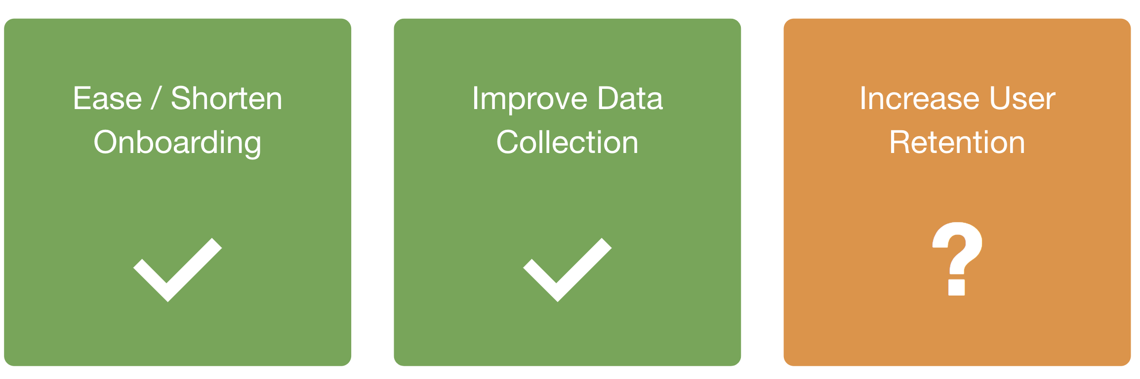
Additionally, reflecting back on the goals that we laid out at the beginning of our design process, we were successful in accomplishing most of them through our designs. We were unable to verify the goal of 'Increase in User Retention' since we could not test it over a period of time.
🗝️ Takeaways
- Designed a mobile app in line with an existing web-based platform.
- Introduced new features to enhance the onboarding flow and improve the data collection process.
- Tested the final outcome with relevant users to garner successful feedback.
©️ Malvi Shah 2021